BOLD blueprints
bold blueprints is a brand that gives classes to women to become architect
THE BRIEF
enerate a detailed brief, setting the stage for the design process. The brand’s standout strength lies in its exceptional customer service, providing support and assistance even outside of classes. My goal was to develop a logo that exudes power while remaining approachable and friendly. The client desired a minimalist design versatile enough to shine across various platforms, from print materials to digital media, ensuring a consistent and engaging visual identity.
BRAINSTORMING DESIGNS
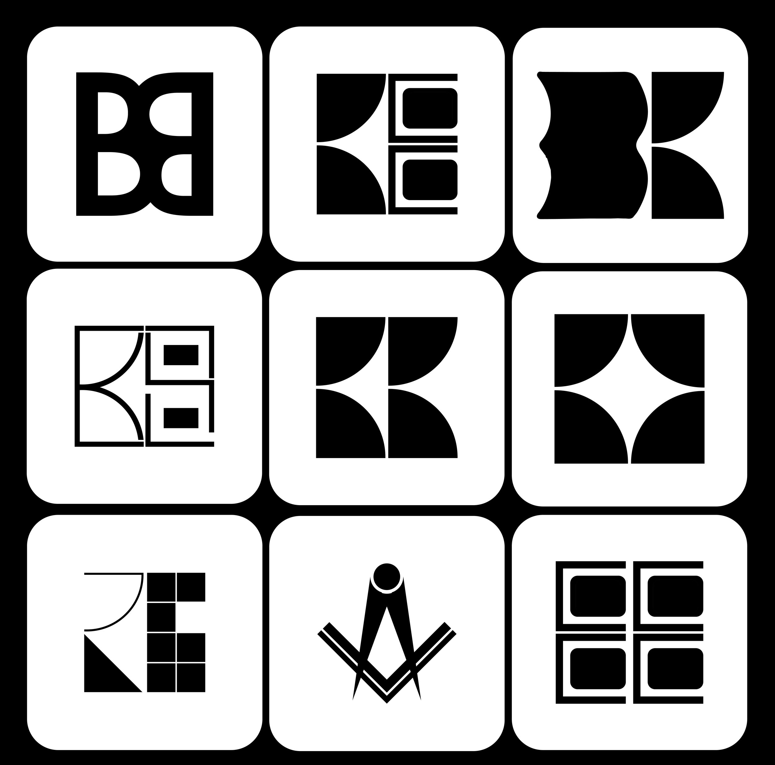
Given that this is a minimalist logo, I dove straight into the digital design process to explore simple yet impactful ideas. The challenge with minimalist logos is conveying a lot with very little, striking the right balance without falling into clichés or overused concepts. To steer clear of creating something too simplistic or derivative, I experimented with numerous concepts, pushing the boundaries of minimalism to craft a unique and distinctive logo that truly represents the brand.
The final result
THE DECISIONS MADE
The design needed to incorporate two key elements: thick, simple lines. Achieving the perfect balance was challenging, but when I noticed how doors are depicted in blueprints, I found inspiration. The shapes resembled a 'B,' leading me to create a bold, simplified depiction of a house that cleverly integrates the letters 'BB' and 'BP,' representing the brand's initials and the concept of blueprints. Paired with a strong, clean font, the design came together seamlessly.
For the color palette, I aimed to reflect the rigorous nature of architecture while avoiding a banking aesthetic. I chose dark blue to convey professionalism, complemented by soft, vibrant colors that infuse the design with a touch of femininity. Instead of relying on clichés like pink, I opted for hues that embody grace, strength, and a sense of fun, creating a distinctive and balanced visual identity.


